Business Context
BuyerAssist's product had grown without a shared visual language.
By 2022, the product had scaled across a 20-person team without any shared design system - every screen was effectively hand-built, and engineering was rebuilding the same UI patterns from scratch each time a new feature shipped.
The Problem
No two screens agreed with each other.
Inconsistent UI across the product, an inefficient design-to-development handoff, and high overhead on both sides - every new feature meant re-solving a problem the team had already solved somewhere else in the product.
Constraints
—No dedicated design systems team - this ran alongside the Warm Referral strategy work, not instead of it
—Had to build component by component without stalling active feature development
—Adoption had to be earned from engineering, not mandated - a system nobody uses is decoration
My Leadership Role
I identified the design system as the biggest lever the team wasn't pulling.
The inconsistency and rework it caused were too costly to leave unaddressed. I initiated it myself, alongside my product strategy work on Warm Referral, and owned it end to end - the component library, the documentation platform, and the governance model that kept it alive after the initial build.
Leadership Scope
Cross-functional collaboration
—Initiated the system alongside my product strategy work on Warm Referral
—Owned the component library, documentation platform, and governance model end to end
—Drove adoption across a 20-person product team with no prior shared system
—Built the governance model that kept the system alive after the initial build, not just the components
Critical Product Decisions
01
Start small, iterate quickly
Rather than a big-bang system, shipped foundational components first and expanded based on what the product actually needed next.
02
Treat the design system as a product
Documentation, versioning, and governance guidelines - not just a Figma file. The system needed its own roadmap and stakeholders.
03
Validate before scaling
A/B tested component designs and ran usability testing with both designers and developers before rolling components out broadly.
Execution
Built a comprehensive Figma design system, a documentation platform, and governance guidelines defining how components got added, changed, or deprecated. Tracked component adoption rate, design consistency, and development time as the system rolled out across the team.
Evidence
design system · cover
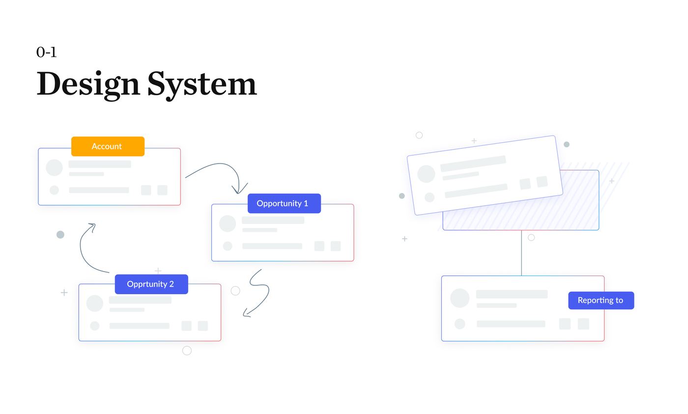
The system as a whole - the piece that replaced a growing pile of one-off screens.
component library
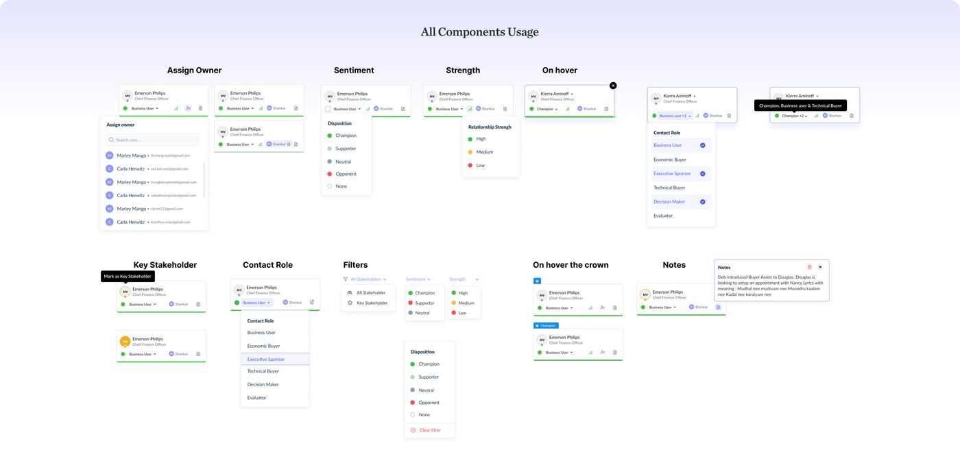
The full component library - the shared vocabulary engineering and design finally worked from.
cards · usage
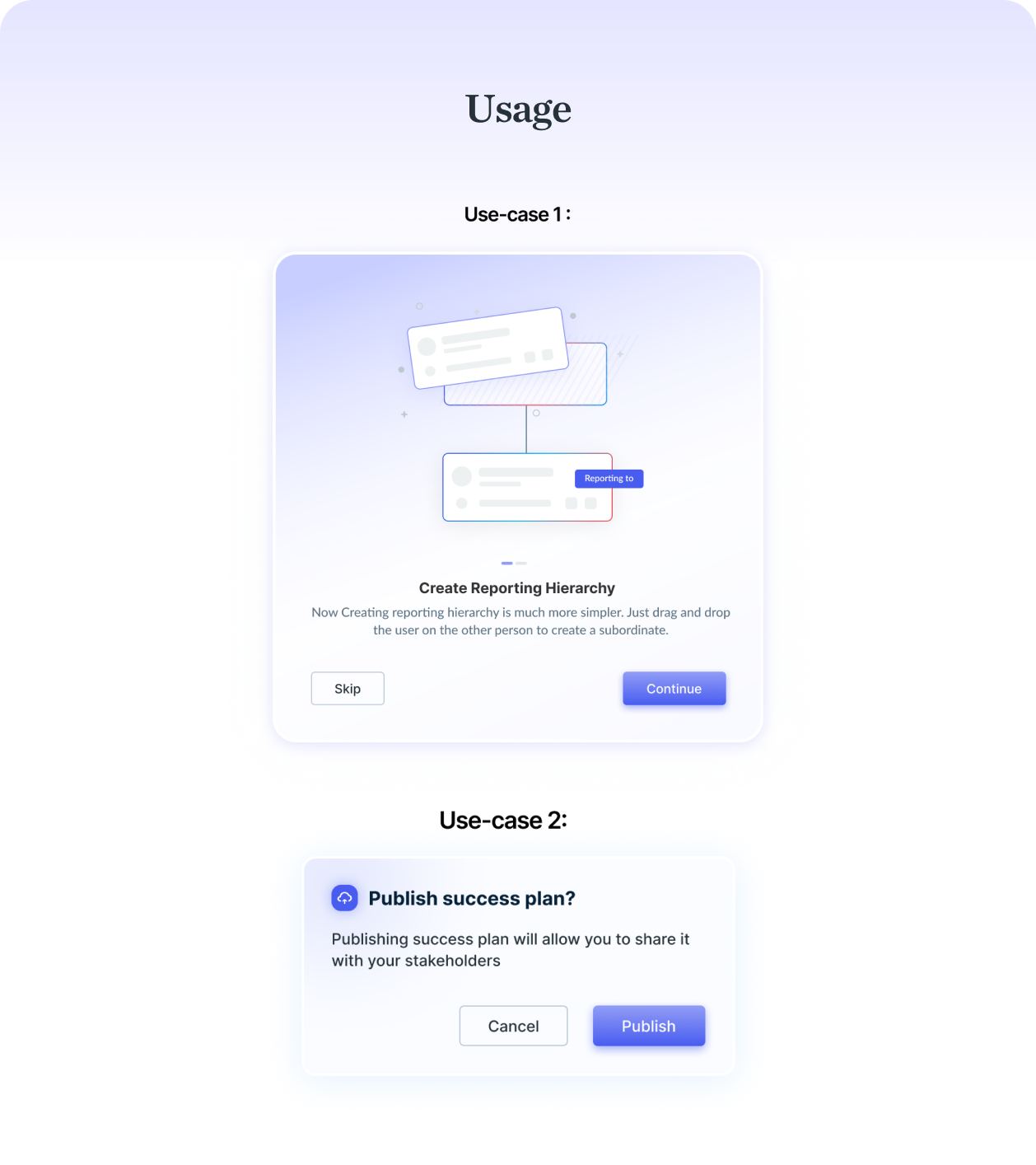
One card component, used consistently instead of being rebuilt per screen.
buttons
Every button variant and state, defined once instead of re-decided every sprint.
documentation · usage
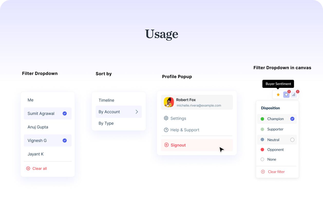
Usage guidelines - the part that made this a product, not just a Figma file.
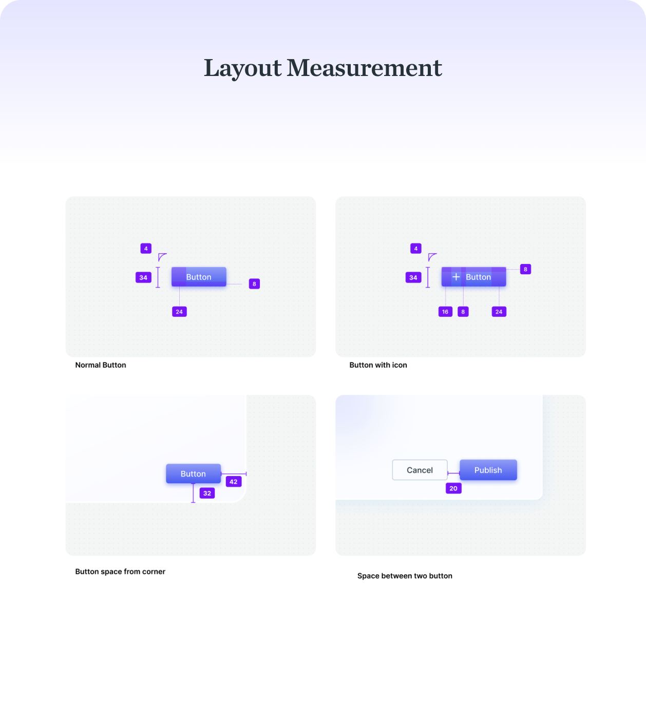
layout · measurement
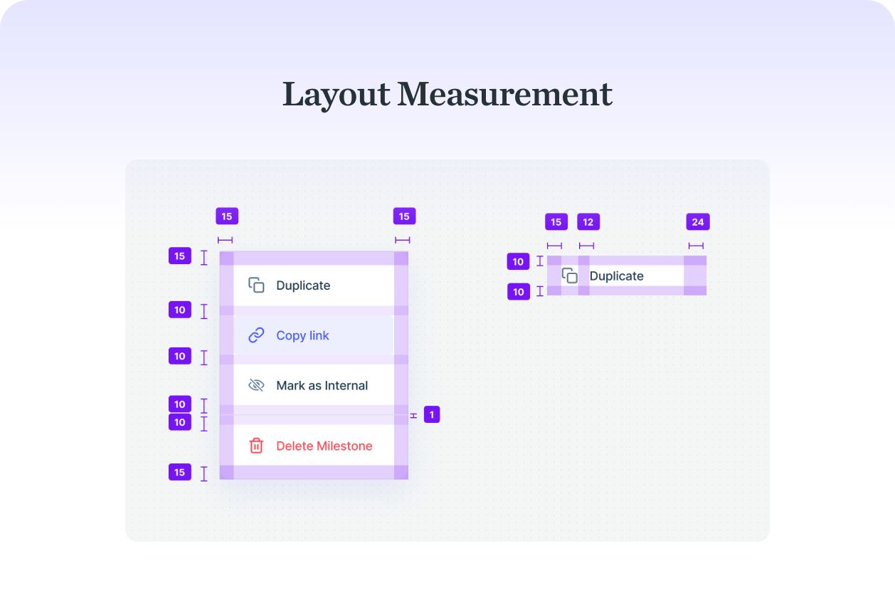
Spacing and layout rules, so every new screen inherited the same rhythm.
Outcome
The system became the default way the team built - new features started from existing components instead of one-off screens, and design-to-development handoff stopped being a recurring friction point. It's still the foundation the product runs on.
Reflection
What stuck with me: nobody pushed back on building this, but nobody had prioritized it either, until I just started. The biggest gaps on a team are rarely contested, they're just unclaimed. I still catch myself scanning for the thing nobody's picked up yet.