The Opportunity
Design validation at Method depended on who was awake. A designer in one region would wait on a peer in another to weigh in before taking work to the client; other times, they wanted an independent check before that client review even happened. Either way, there was no consistent way to validate a design against every angle - usability, accessibility, trust, business impact - without waiting on someone else's calendar.
The Initiative
Design validation was informal and person-dependent - you got as thorough a review as whoever had time to give one.
I built a small AI-assisted copilot for the global design team to validate work against six lenses on demand, so a designer could check every angle before taking it to the client instead of waiting on a colleague first. It wasn't part of my workstream brief; I ran it alongside my actual responsibilities because the gap was clear.
Leadership Scope
Cross-functional collaboration
—Self-initiated the tool outside my formal workstream scope, because the validation gap was clear
—Built it solo, then shaped the review governance model - it flags, a person still decides
—Drove adoption across the global design team, spanning three time zones
Critical Product Decisions
01
Kept a human in the loop, not a gate
The team almost treated it as a pass/fail gate. I pushed back - it flags, a person still decides. AI didn't change what good design is, it changed how easily a designer could validate their own work before the client saw it.
02
Reviewed the whole journey, not screen by screen
Up to 20 screens go in together, grounded as one continuous flow instead of independent findings per screen - closer to how a real design review actually reads a product.
03
Rolled every finding up into business risk
Every finding closes with a business-impact tag - conversion, retention, support cost - so the review lands as a business conversation, not just a design one.
Evidence
The Tool
overview · six lenses, one verdict
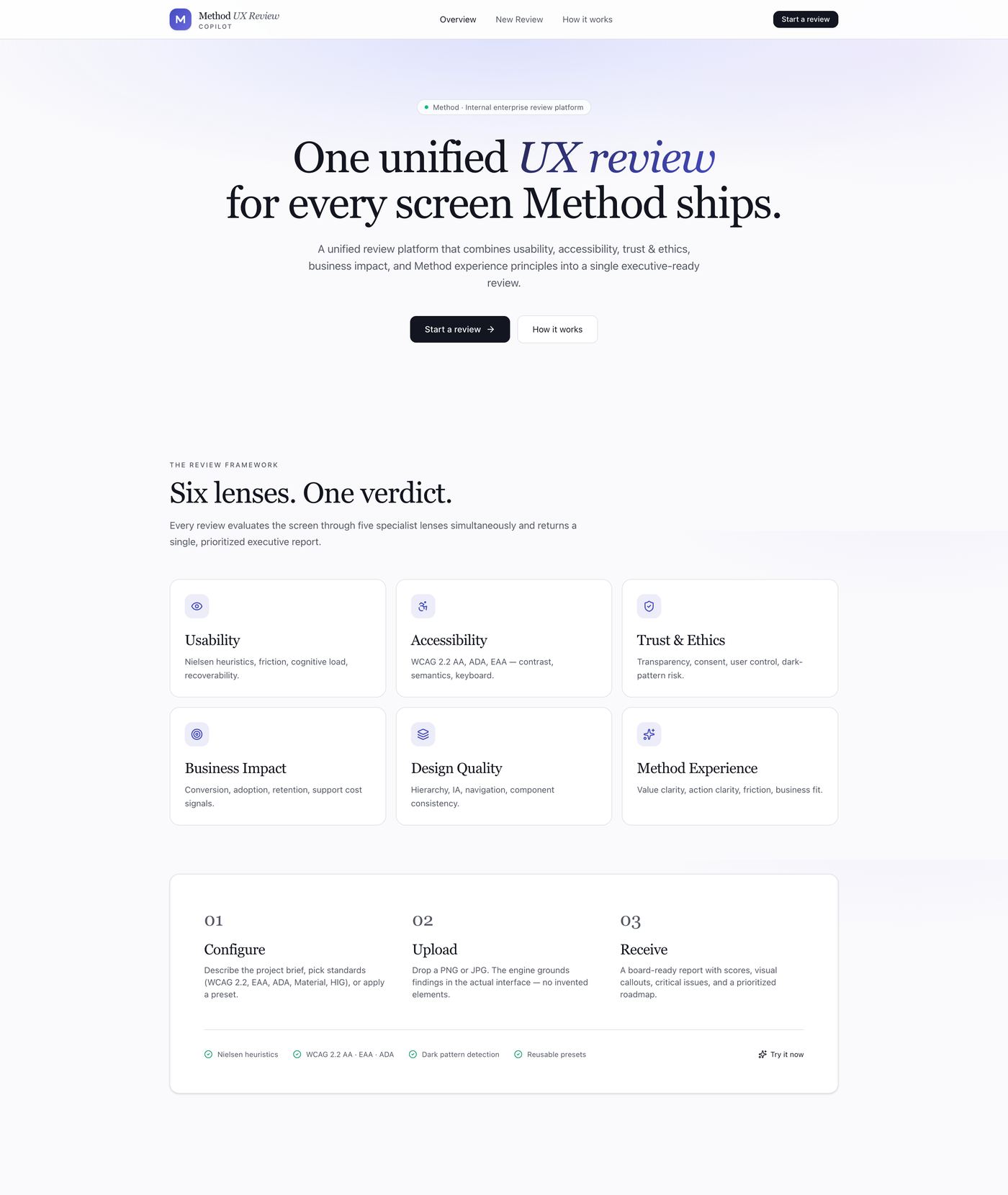
Usability, accessibility, trust & ethics, business impact, design quality, and Method's own experience framework - combined into one report instead of five separate ones.
configure · pick your lenses
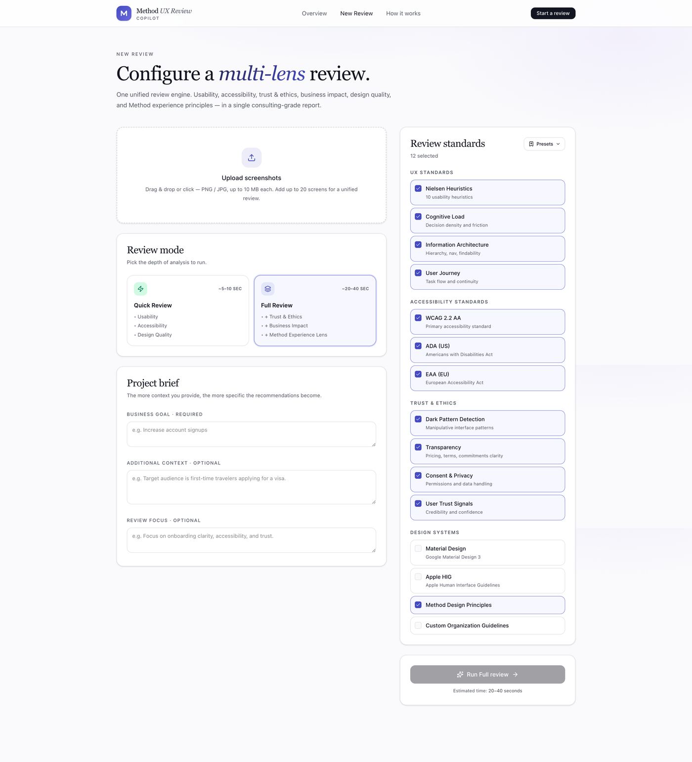
Every standard is selectable - WCAG 2.2 AA, ADA, EAA, Nielsen heuristics, dark-pattern detection, even a specific design system. This run: 12 standards, Full review depth.
multi-screen · the whole flow
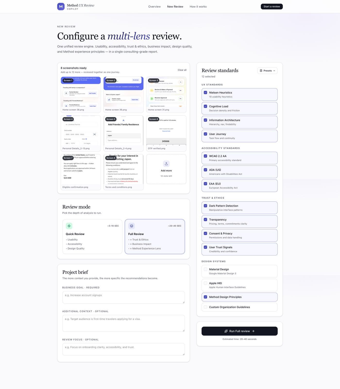
All 8 J-ESTA screens attached and reviewed as one continuous journey - home through terms & conditions - not eight disconnected reviews.
The Result - Six Lenses, One Verdict
the verdict · 68/100
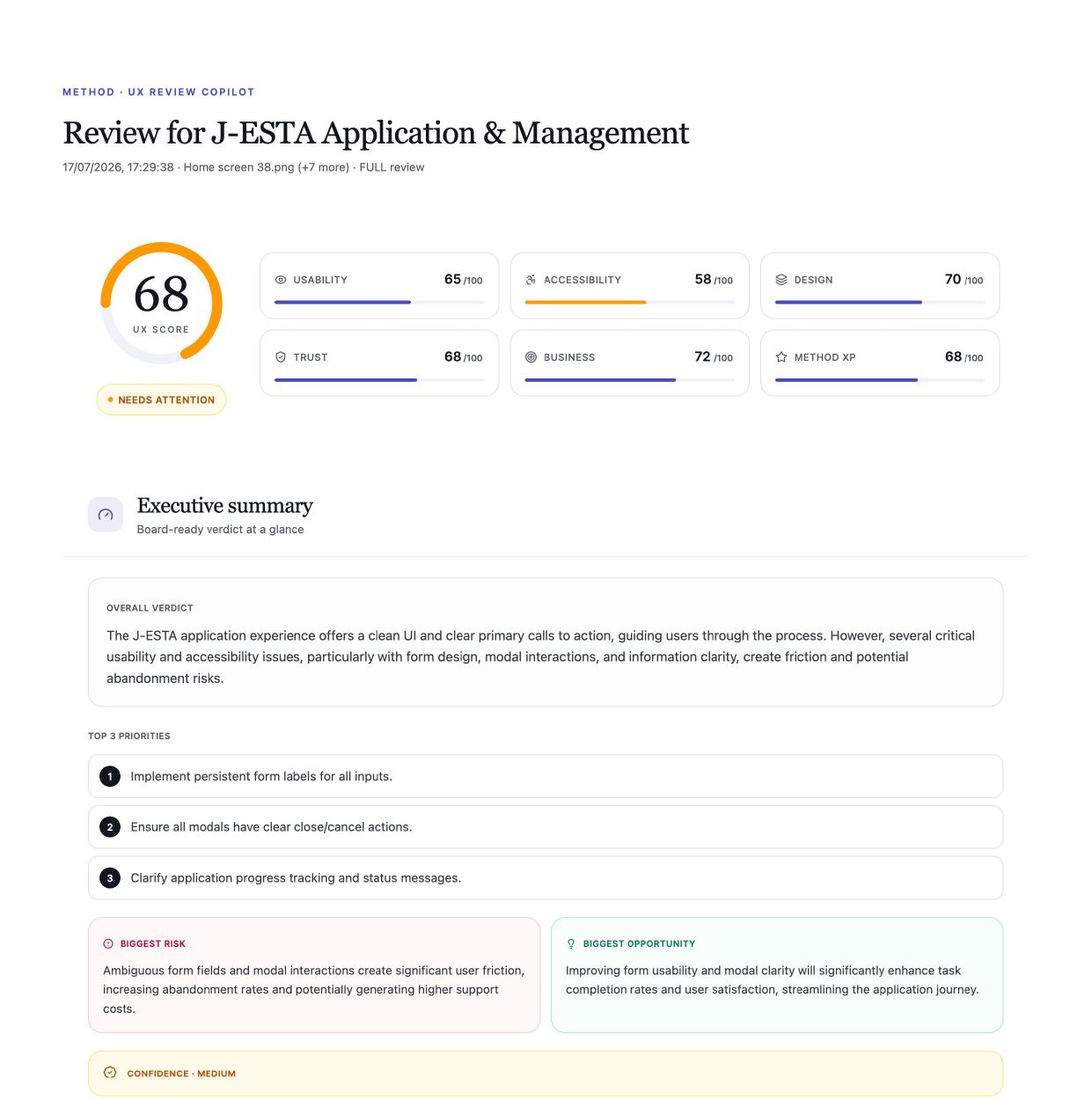
One score, six lenses, needs-attention flagged immediately - Accessibility (58) called out as the weakest lens before you read a single finding.
usability lens · a finding
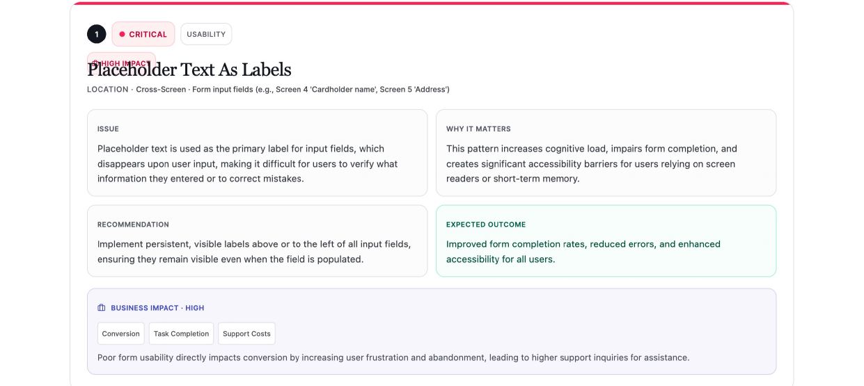
Every finding is severity-graded, tied to a real screen location, and paired with a recommendation and a business-impact tag - not just "this is wrong."
design quality lens · strengths
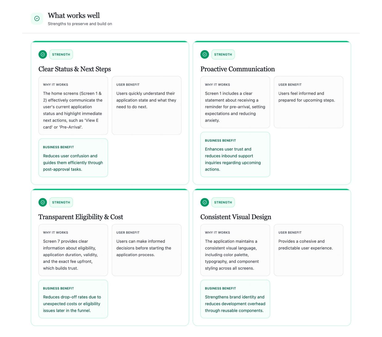
Every review also surfaces what's working. A second opinion, not just a fault-finder - the strengths get a business case too.
accessibility lens · WCAG 2.2 AA
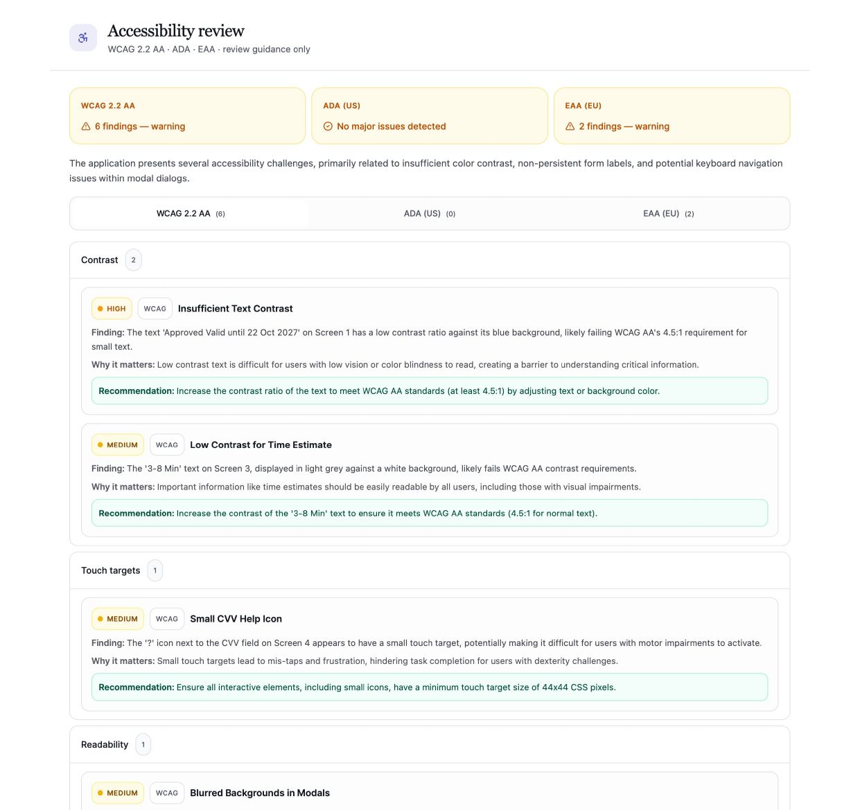
Mapped to real standards - WCAG 2.2 AA, ADA, EAA - and broken down by category: contrast, touch targets, keyboard, screen reader. Not a generic accessibility score.
trust & ethics lens
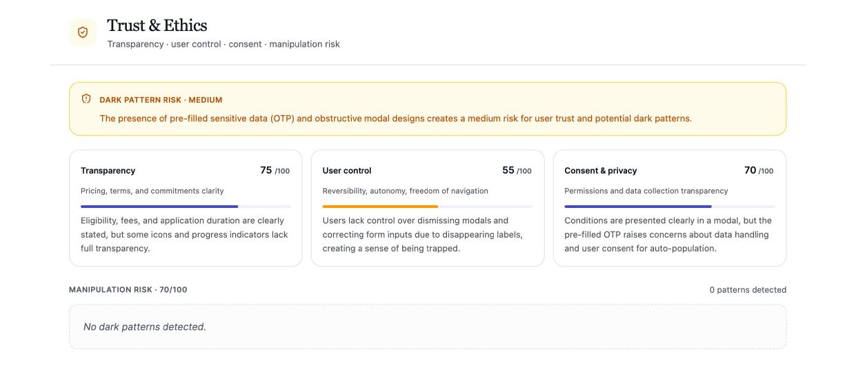
Dark-pattern risk, consent clarity, and user control - the lens most review tools skip entirely.
method experience lens · proprietary
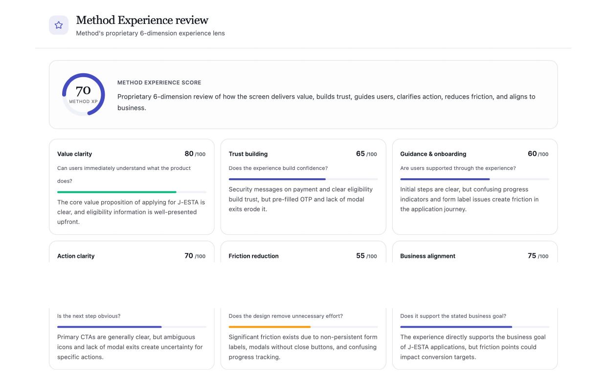
The one lens that's ours: does the screen build trust, guide the user, and align to the business goal - Method's own 6-dimension framework, not a borrowed heuristic.
business impact lens · the roll-up
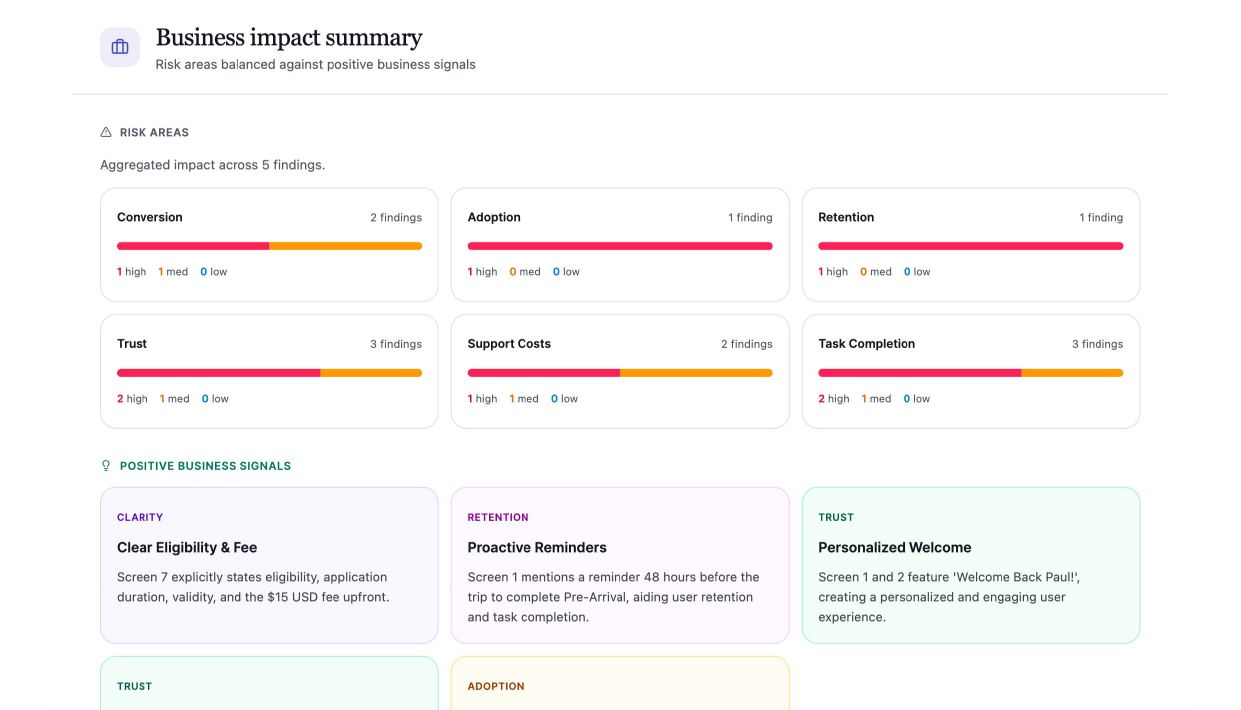
Every finding rolled up into business risk - conversion, retention, support cost - so the review closes as a business conversation, not just a design one.
Outcome
The global design team adopted it as a standard step before taking work to the client, not a mandate I pushed through - it earned that by giving designers a way to validate on their own timeline instead of waiting on a colleague first.
Reflection
Easy to overclaim a tool like this. What actually happened: a handful of designers across regions started validating their own work before it went to the client, instead of waiting on someone else's feedback first. That's a real behavior change, even a small one. I'd rather be precise about that than inflate it.